
Purexo
The full identity of a cleaning company: a fox for a mascot, a soft shade of blue, and documents as clean as a polished window, from business card to invoice.
The context
Cleaning has a bad reputation, graphically.
Cleaning company logos all look alike: a water drop, a loud green, three bubbles and done. Purexo wanted the exact opposite. A soft, warm image that earns trust before the first sweep of the mop.

The mascot
A fox, because it is spotless.
The fox is one of nature's tidiest animals: it spends a good part of its day grooming. Hard to find a better ambassador for a cleaning brand.
Ours has a white coat, a clever nose and a mop always within paw's reach. Friendly enough to reassure, serious enough to be trusted with your premises.
Palette
The logo
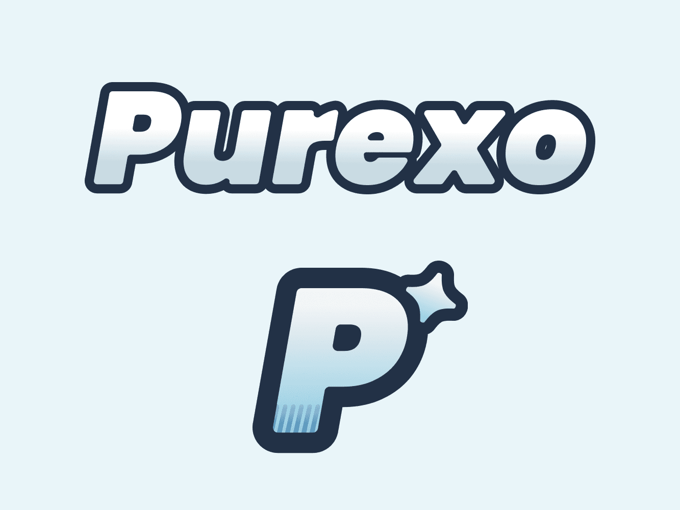
A logo that gleams, a letter that stands alone.
The Purexo wordmark is treated like a freshly polished surface: pearly gradient, navy outline, a little glint on top. Next to it, a starred P works as an icon for avatars, the favicon and anything too small for the full word.
The business card
Front, back, not a wrinkle.
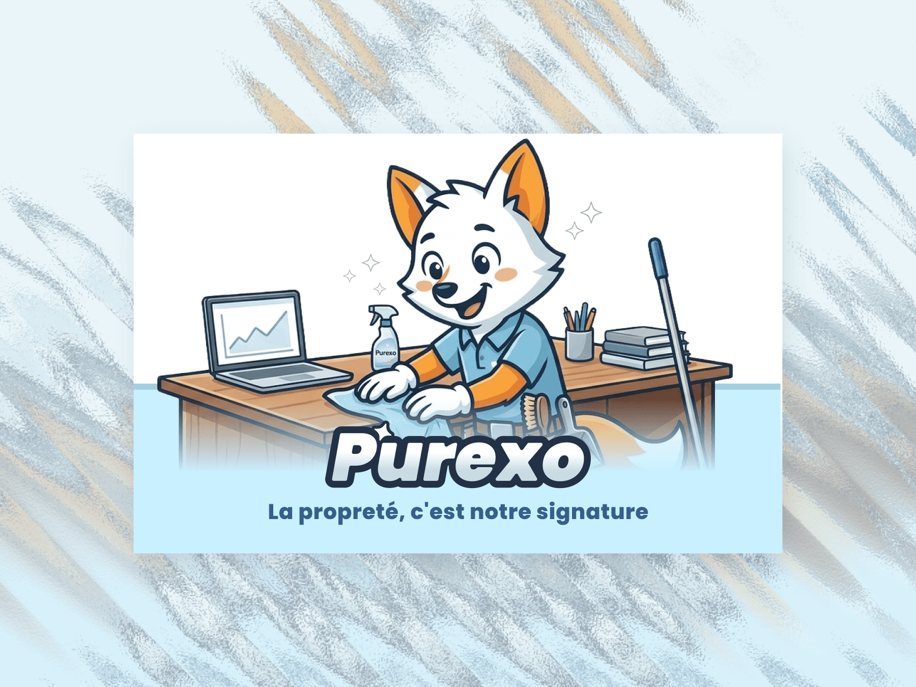
The front carries the mascot at work and the brand promise. The back lists the services and the contact, no clutter. A card that breathes, like a surface just wiped clean.
The invoice
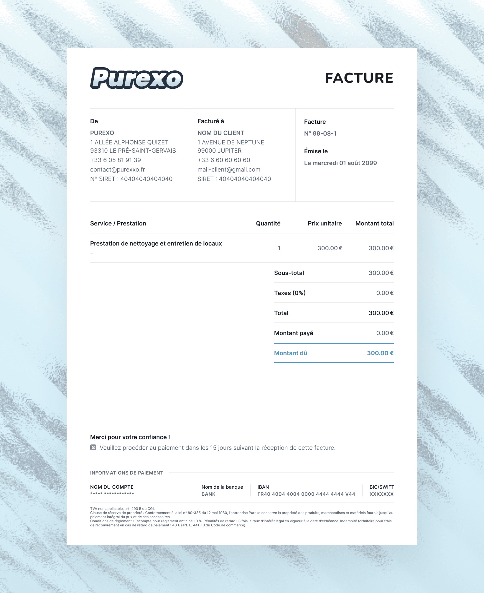
Even an invoice can be well kept.
An invoice template in the brand's colours: logo up top, legal notices tidied away at the bottom, and above all a hierarchy that walks the eye straight to the amount due, underlined in blue.
Details, services, totals, banking information: every block has its place and its breathing room. The document fills in in two minutes and always comes out clean, whoever the client is.
Delivered
- Primary logo and its icon version
- Fox mascot
- Blue and white palette
- Double sided business card
- Invoice template
“Cleanliness is our signature.”
Purexo · Brand signature
Got a project of the same kind?
Let's talk. The first call is on me, no strings attached.